
%201.svg)


Gray Wall Paint: How to Choose a Shade That Looks Right in Your Home

Key Takeaway
Gray wall paint rarely reads as a true neutral because every shade carries an undertone, whether blue, green, red, or yellow, that shifts dramatically depending on your room's light and fixed finishes. No single gray works everywhere. Match the undertone to your flooring, trim, and cabinetry, then test large samples morning, afternoon, and under your night bulbs before committing.
The right gray wall paint is the one whose undertone, light reflectance, and sheen agree with your room's real light and the finishes you're keeping. There is no universally best gray. If you've decided to repaint but haven't settled on a color, you don't need another list of gray paint colors. You need a process you can run in your own space.
Why gray paint is rarely a true neutral

Undertones are the faint colors sitting beneath the one you think you're seeing. Blue and green pull gray cool. Red and yellow pull it warm. That hidden base is why two shades that look identical on a chip behave differently on your walls. Saturation matters too: more pigment means the undertone pushes harder. Deep gray paint colors like charcoal and slate add weight, which suits an accent wall or a room you want to feel enclosed.
Is gray out of style for 2026?
No, but it has changed. The cold, generic cool grays that covered everything last decade are far less dominant. Warm gray, greige, gray-green, and charcoal are the gray paint colors reading as current. Forecasts published for 2026 and 2027 lean toward warmer shades: sandy tones, taupes, and gray-beige blends. Use that to narrow your shortlist, not to select your color.
Start with the finishes you aren't changing

Your wall color answers to the materials staying put: flooring, cabinetry, countertops, tile, fireplace stone, trim, and any large upholstered piece. Find the undertones already in those materials, then select a gray family that agrees with them. Put a cool blue-gray beside yellow-toned oak floors and the floors suddenly look orange. The paint didn't change. The contrast did.
How gray paint colors work with whites and other colors
Trim is the first pairing decision. A crisp white next to warm greige can push the walls toward beige, while a softer white keeps that same gray neutral. Cool grays hold up better against clean, bright whites. Past the trim, gray carries other colors easily: black hardware, aged brass, deep green, navy, terracotta, natural wood. Paired with layered whites and soft textiles, a light gray gives you the airy sophistication most people picture when they ask for gray. Paired with charcoal cabinetry or a dark floor, the same wall turns modern and grounded.
How natural light and lighting conditions change gray walls

North-facing and south-facing rooms
North light is steady and cool, and it amplifies any blue or violet in your gray. Warm gray or greige is the safer start there. South-facing rooms get warmer light most of the day, so a balanced or slightly cooler gray usually holds its neutrality.
East-facing and west-facing rooms
East-facing rooms run warm in the morning and cool by afternoon; west-facing rooms do the reverse. Exposure is only one factor. Window size, trees outside, color reflected off siding or decks, and light borrowed from adjoining rooms all shift the lighting conditions in a space.
Bulbs after dark
The U.S. Department of Energy recommends a color rendering index of at least 80 for interior lighting, and 90 or higher for excellent color fidelity. Judge your gray under the bulbs you live with at night, not just at noon.
What LRV tells you about gray paint colors
Light Reflectance Value runs 0 to 100, where 0 is total absorption and 100 total reflection. Real paint colors land between those ends. LRV is useful for comparing the depth of two or three finalists: a light gray feels airier and calm, a deeper one moodier. What it can't tell you is undertone. Online color tools help you shortlist, but a high-LRV blue-gray can still feel cold in a dim room.
What paint sheen is best for gray walls?

- Matte or flat: softest look, most forgiving of patches, dents, and texture.
- Eggshell or low-lustre: the common middle ground for living areas and hallways.
- Satin: easier to clean, but it highlights uneven drywall and roller marks.
- Semi-gloss or gloss: better for trim, doors, and millwork than for broad walls.
Sheen names aren't standardized across product lines, so describe the result you want and confirm the finish before the first coat. We use premium paint products backed by lifetime manufacturer warranties.
How to test gray paint before you commit
- Narrow to two or three undertones, not ten shade names.
- Paint large samples. A small chip or a screen image will mislead you.
- Test on at least two walls with different exposures, next to trim, flooring, cabinets, and the whites you're keeping.
- Look morning, afternoon, and under your normal night lighting.
- Confirm the sheen before you approve the color.
A free color consultation comes with every project we take on, so you don't have to run this alone.
How Our Paint Color Selection Process Works

One of the biggest misconceptions we hear from homeowners is that they need to have their paint color chosen weeks before their project starts. You don't. We actually recommend that customers visit their local Sherwin-Williams store to see colors in person, compare options, and have custom colors mixed if needed. Sherwin-Williams is the brand we use and recommend, and with locations throughout the area, getting the paint is rarely a scheduling issue.
Once you've narrowed down your choices, simply give us the Sherwin-Williams color name or code. We can pick up the paint a few days before the project—or, in many cases, even the day we start. We'll often apply a small test area first so you can see how the color actually looks in your home and in your lighting before we move forward with the full project.
And yes, you can change your mind. We've had homeowners who were completely confident in their color choice right up until the project started, only to see the sample on the wall and decide they wanted something different. We've even had customers change their minds after seeing an entire porch painted. We'd much rather make the adjustment than have you live with a color you don't love.
The goal is to make the process easy and low-pressure. You don't need to commit to a color months in advance just because you're scheduling a painting project. Take your time, see the colors in your actual space, and we'll handle getting the paint when you're ready.
Why does my gray paint look blue, purple, or green?
Most of these complaints trace back to undertones you couldn't see on the chip.
Surface prep decides whether gray looks right
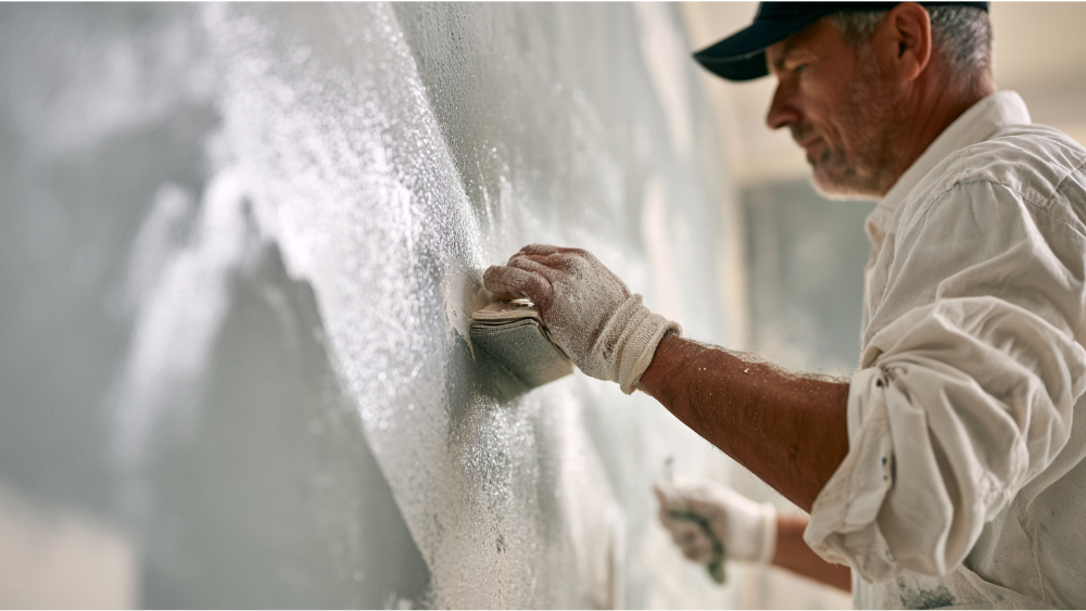
A paint-ready wall is clean, solid, and dry, with no loose paint, cracks, grease, or sanding dust left behind. Patches and fresh joint compound get sanded, cleaned, and primed before the finish coat. Gray is unforgiving. Even a low-sheen gray will telegraph a sloppy patch or a wavy cut line across the room. Surface prep is always part of the job for us, because that's what produces clean, long-lasting results.
Painting safely in older homes
The EPA's Renovation, Repair and Painting Rule applies to paid work that disturbs painted surfaces in most pre-1978 housing, and the EPA estimates roughly three-quarters of pre-1978 U.S. homes still contain some lead-based paint. The agency recommends hiring a lead-safe certified contractor. We're EPA Lead-Safe (RRP) Certified. The EPA also cautions that low-VOC labeling doesn't automatically mean safer indoor air, so ask about options and ventilate well.
Frequently Asked Questions
What is the most popular gray wall color?
Warm grays and greiges are the most popular gray choices right now, largely because they're easily paired with a range of woods, soft whites, and natural stone. Popularity matters less than how a shade behaves in your room.
What is the best shade of grey for walls?
The one whose undertone matches your fixed finishes and whose LRV suits your light. A light gray keeps a space feeling calm and open. Charcoal and slate add a touch of depth where you want the room grounded, and both pair well with warm whites and natural wood.
Get a free estimate and color consultation
Large samples and honest surface prep keep you from repainting in two years. If prep on an exterior project uncovers rot or damaged siding, our team handles the rot repair, siding, and carpentry, so you're never coordinating two contractors. Every project starts with a free estimate, a clear scope, and a real number before work begins, plus a free color consultation. Call us today at 206-222-0435.
