
%201.svg)


Living Room Paint Ideas That Work With Natural Light
Key Takeaway
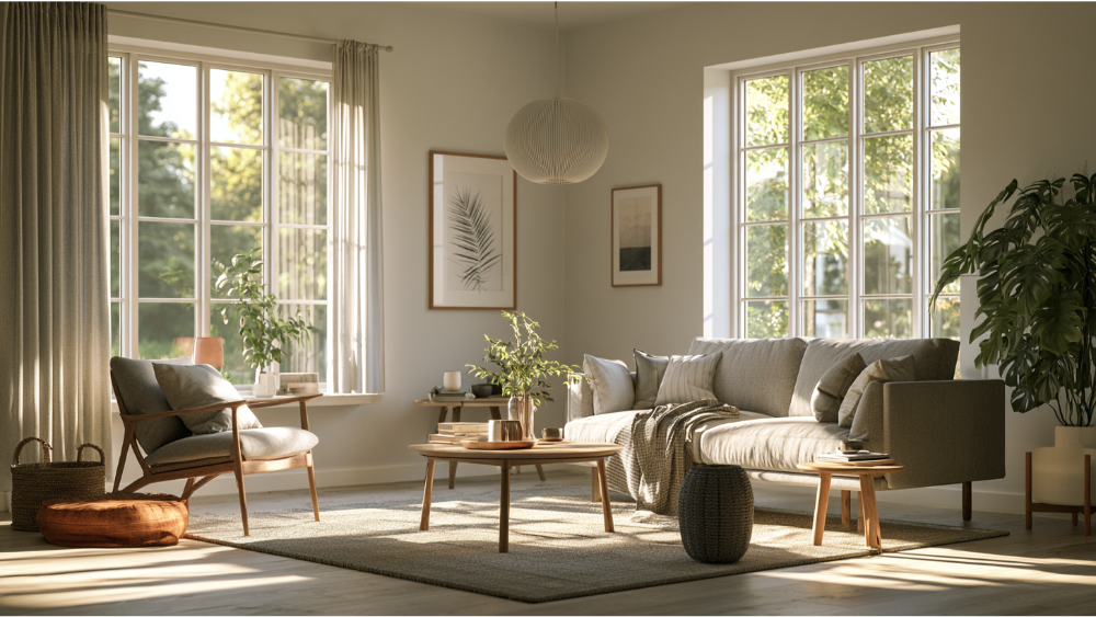
The best living room paint ideas that work with natural light start with your room's orientation: warm whites, creams, and soft neutrals suit cool north-facing rooms, while south-facing spaces can handle cooler tones and deeper accent colors. Check each color's LRV and undertone, then test large samples on at least two walls across morning, afternoon, and evening light before committing.
Pick your living room paint color based on the light you actually live with, not the chip you liked in the store. The direction, strength, and timing of your natural light change how any paint color reads, so warmer, higher-LRV hues tend to help cool or dark rooms feel brighter, while bright south- or west-facing rooms can carry cooler tones or deeper accent colors. Then test large samples on more than one wall at different times of day before you commit. If you're planning a repaint and don't want to regret the shade six months from now, treat this as a decision guide rather than another trend list.
Start With the Light, Not the Paint Chip
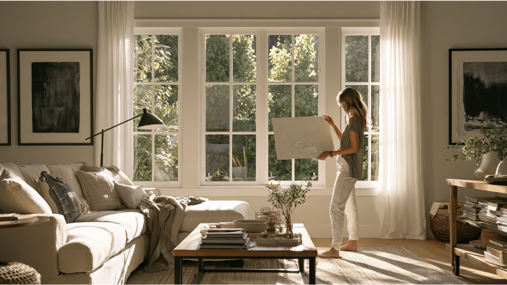
The same paint color can look warm and inviting in one living room and cold or muddy in another. Orientation, time of day, and season all shift it. So do your floors, furniture, trim, and window coverings, because color bounces off everything around it. A beige that looks soft next to warm oak can read yellow next to cool gray tile. In cloudier regions like the Seattle-Tacoma area, seasonal gray light and heavy tree cover can pull warmth right out of a shade, which is exactly why testing in your own room matters more than trusting a swatch. A pale gray that looked crisp in a bright showroom can turn flat and lifeless once it's on your walls under overcast skies. Read the light first. The chip comes second.
How to Tell What Kind of Natural Light Your Living Room Gets
Stand at your main window wall and open a compass app on your phone. Note which direction the windows face, then watch how the space actually behaves across a day. Each exposure has a personality:
- North-facing: cooler, steadier, lower light with little glare. Colors can look flatter and more blue, and north facing rooms often need a warm nudge to feel alive.
- South-facing: the warmest, brightest, most consistent light. South windows bring in the most sun, so paint colors stay lively most of the day.
- East-facing: bright, clean morning light that cools and flattens by afternoon.
- West-facing: dim in the morning, then strong warm light late in the day.
- Mixed or open-concept: more than one exposure at once. Judge the color by the main window wall and the time you use the room most.
Watch the space in the morning, afternoon, and evening. And pay attention to when you actually live in it, because a room used mostly at night is a different color problem than a bright weekend hangout spot. The number and size of your windows matter too, since a wall of glass floods a space with far more light than a single small window on the same side of the house. Rooms with only small windows behave more like dim spaces no matter which way they face.
Best Living Room Paint Colors by Natural Light
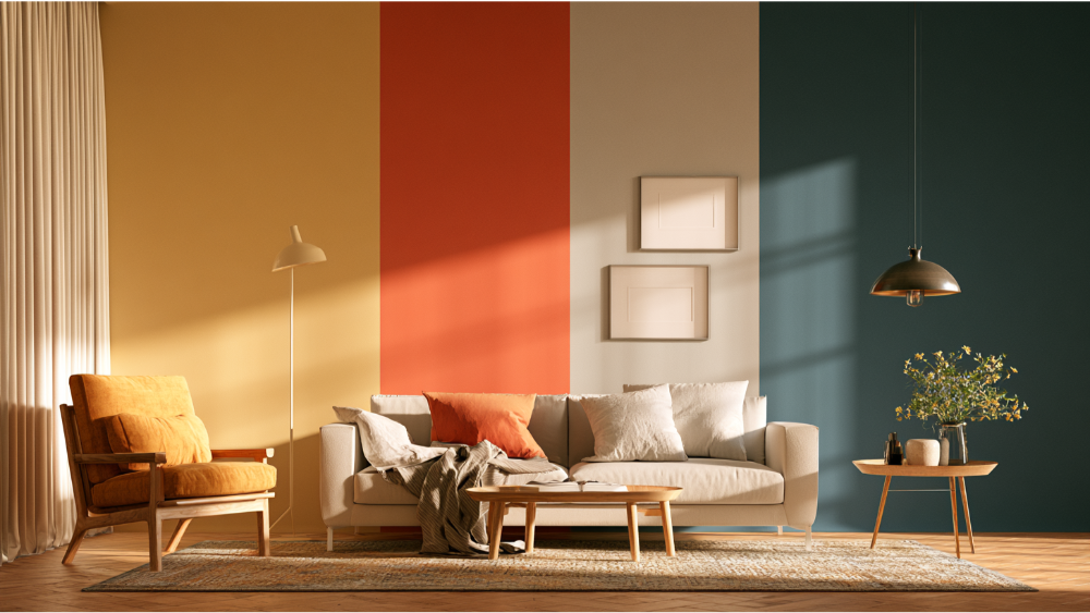
Think in color families here, not brand-specific chip names. Families stay useful over time, and they give you room to find the exact right shade that fits. Whatever you land on, still test it in your own space, because your floors and light will have the final say.
Best Paint Colors for North Facing Rooms and Dark Rooms
North light is cool and even, so warm-leaning paint colors help balance it out. Reach for warm whites, creams, soft beige, warm greige, muted clay, and warm taupe. A soft sage green with warm undertones or a pale yellow that mimics sunlight can bring life to an otherwise flat space. The point is to counter the cool daylight with an undertone that pushes back gently. In north facing rooms, a color with a touch of gold or peach in its base will read far friendlier than anything crisp and cool. Soft greens and warm neutral paint colors are an excellent choice here for the same reason.
Be careful with cool grays and blue-grays here. They can go cold and lifeless under north light, unless you're deliberately after a calm, moody feel. A soft warm gray can still work, as long as it isn't leaning blue. Dark rooms with limited natural light follow the same logic: lean warm, avoid anything that adds to the chill, and let an off white or a gentle cream do the brightening. Warm colors will always do more to brighten these spaces than cooler hues.
Best Paint for South-Facing Living Rooms
This is the most forgiving exposure. Strong, consistent sun lets you use balanced whites, soft neutrals, muted greens that connect to the foliage outside, pale blues, and light grays with a blue undertone. South rooms also carry deeper, rich hues and accent colors well, so this is the place to try something with more presence, whether that's a moody navy on a single wall or a saturated green built-in. One caution: very warm yellows and oranges can intensify under all that steady sun and end up louder than you expected, so test them before you decide.
East Facing Rooms and West-Facing Living Rooms
These two shift the most across the day, so match them to when the room gets used. East facing rooms get clean, bright morning light and cooler, flatter light later on. Clear, sunny paint colors, balanced neutrals, warm whites, soft green, and beige-gray blends all read well when the morning light is at its best. If your room is mostly a morning space, lean into that.
West-facing rooms are the opposite. Dim early, then flooded with warm, strong light in the late afternoon and evening. That warm light amplifies warm colors, sometimes to the point they feel intense. Cooler neutrals, soft blues, greens, taupes, and grounding mid-tones hold their balance through the golden-hour glow. If you use the room mostly at night, choose for the warm light, not the pale mornings. These same principles carry into an adjoining dining room if the two share a wall of windows.
Bright Rooms vs. Dim Spaces With Little Natural Light
Bright rooms that get plenty of natural light can handle more depth and bolder color than most people expect. But the color still has to work with glare, your flooring, and your furniture, so don't assume a saturated shade will behave the same way it did in a magazine. When a space gets that much natural light, even richer color choices stay balanced.
Dark or dim spaces are trickier. White reflects the most light, which is why people reach for it, but stark pure white often goes flat or cold in low light and makes a room feel colder, not brighter. Lighter paint colors in warm off white tones, gentle neutrals, or an intentional cozy color usually read better and brighten a dim room without going cold. When there's enough light to work with, a lighter shade will bounce it around the whole living area. A couple of simple tricks help too: light-colored rugs and furnishings amplify whatever brightness you have, and a mirror placed opposite the windows helps reflect light deeper into the room. Where daylight runs short, adding floor lamps and wall sconces gives you warm artificial light that keeps the space from feeling dim after dark.
What Is LRV, and How Do You Use It?
LRV stands for Light Reflectance Value, and it measures how much visible light a color reflects on a scale of 0 to 100. Zero is black, reflecting no light. One hundred is white, reflecting all of it. The higher the number, the more light the paint bounces back into the room, which is why higher-LRV hues tend to work well in low-light or north facing spaces. Lower-LRV colors absorb more light and create a moodier, deeper effect with softer shadows.
There's no universal "perfect" LRV for a living room, and any guide that hands you one number is oversimplifying. Use LRV as one filter alongside your exposure, the color's undertone, your flooring and trim, and how you actually use the space. Two paint colors with the same LRV can still read completely differently once undertone enters the picture. Light grays in the 60 to 70 range, for example, can look airy in a sunny room and dreary in a north-facing one.
Don't Forget Undertones
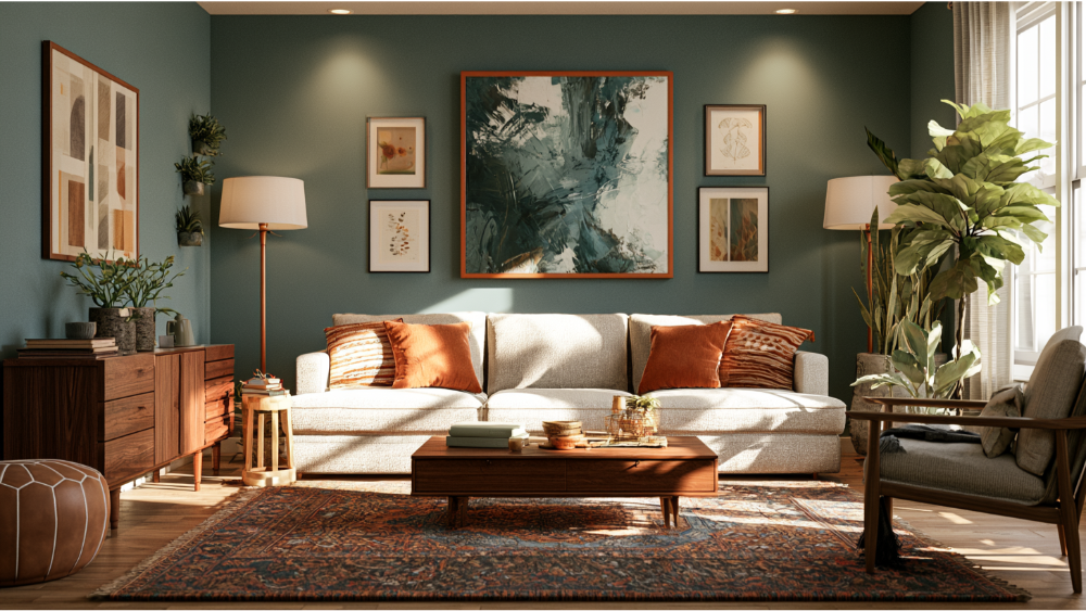
Every color has an undertone that steers how it reads: warm (yellow, red, orange leanings), cool (blue, green, violet leanings), or neutral. Undertones are where most color regret comes from, because they're subtle on a chip and obvious on a wall. A few practical pairings to keep in mind:
- Warm floors, like oak or honey-toned wood, pair better with warm or balanced paint colors.
- Cool gray flooring can clash with a very yellow white and make it look dingy.
- Muted greens and sophisticated greiges reflect daylight nicely and tie a room to the outdoors.
One thing people miss: greenery or trees right outside the windows cast green light into the room and shift how everything reads. That green cast can push a neutral gray toward something unexpectedly cool or murky, and it can even flatter a warmer color like a dusty pink. It's a real factor in leafy Pacific Northwest neighborhoods, and it's another reason a chip lies and a sample tells the truth. This is where interior designers earn their keep, since reading undertones is half of good interior design.
Using an Accent Wall the Right Way
A single accent wall is an easy way to add more color without committing the whole room to a bold shade. In a bright, south-facing space, a deeper hue on the wall behind the sofa reads as intentional rather than heavy. Even a bright white or crisp off white room can gain warmth from one grounded feature wall. Many interior designers reach for a Benjamin Moore color when they want a proven, versatile backdrop, though any premium line offers plenty of the best paint colors for the job. Whatever brand you choose, test the accent shade in your own light before you commit.
How to Test Paint Samples Before You Commit
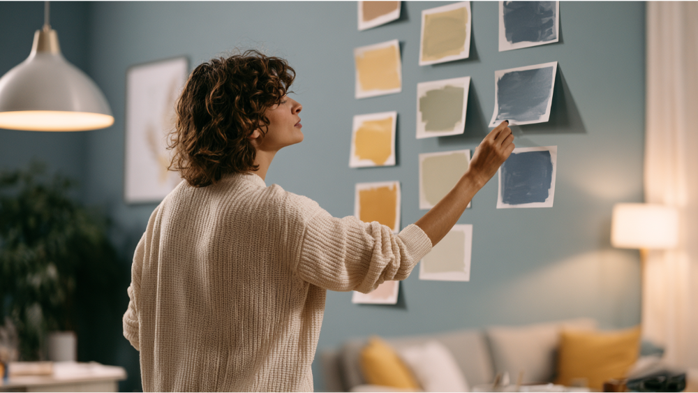
This step is not optional. It's the single biggest way to avoid a color you'll want to redo. Here's a process that works:
- Narrow your list to three to five paint colors. More than that and you'll second-guess yourself.
- Paint large samples on at least two walls, including the main window wall. Small dabs won't show you enough.
- Look at them in morning light, afternoon light, evening light, and at night with your lamps on. Colors shift under natural and artificial light both.
- Check each sample next to your trim, flooring, sofa, rugs, and built-ins.
- Live with the samples for a few days before you decide.
A color that looks perfect at noon can go cold by dinner. A warm gray can even drift toward lavender in evening light, which is the kind of surprise you want to catch on a sample board, not on a finished wall. Giving yourself a few days of real light is how you catch that before the whole room is painted. The best paint for a room where you spend time every evening is the one you have watched through a full day.
Which Finish Reflects More Light: Matte, Eggshell, or Satin?
Sheen changes how light bounces off your walls and how the room feels. A quick rundown:
- Matte or flat: softest look, hides wall imperfections best, reflects the least light, and is the least washable.
- Eggshell: the common living room choice. A slight sheen, practical to clean, and a good middle ground.
- Satin: more durable and cleanable, reflects more light, but shows wall flaws and glare more readily.
- Semi-gloss: best saved for trim and doors, not broad living room walls.
In a dark room, a touch more sheen (eggshell or satin) can help bounce what little light you have and brighten the space slightly. But higher sheen also reveals every dent and ripple in the drywall, which brings us to the part most trend articles skip.
Why Proper Prep Makes the Color Look Better

The color and finish you chose only look right on a surface that's been properly prepared. Light-reflective hues and higher-sheen finishes both broadcast imperfections, so a beautiful shade over a bad wall still looks like a bad wall. That's why we lead with surface prep on every interior job: patching holes, sanding rough spots, cleaning surfaces, spot priming, sealing stains, caulking trim gaps, and repairing damaged drywall or trim before a drop of finish coat goes on.
This is the difference between a result that lasts and a job you're repainting in two years. Attention to detail during prep is what produces the clean, long-lasting results the reader actually wanted when they started looking at color chips. A fresh coat over solid prep holds its color and warmth for years. Skipping prep is what cut-corner painters do, and it always shows once the light hits the wall.
Low-VOC Paint and Ventilation for an Occupied Living Room
The living room is a space your family actually lives in, so what's in the paint matters. The EPA notes that levels of several organic pollutants average 2 to 5 times higher indoors than outdoors, and it recommends plenty of fresh air when you paint: open windows and run extra fans. Choosing low-VOC, family-safe products keeps emissions lower without giving up finish quality, and premium low-VOC paints hold up just as well as their higher-fume counterparts. Between good ventilation and the right products, you get the color you want and cleaner air while the paint cures.
A Note for Older and Pre-1978 Homes
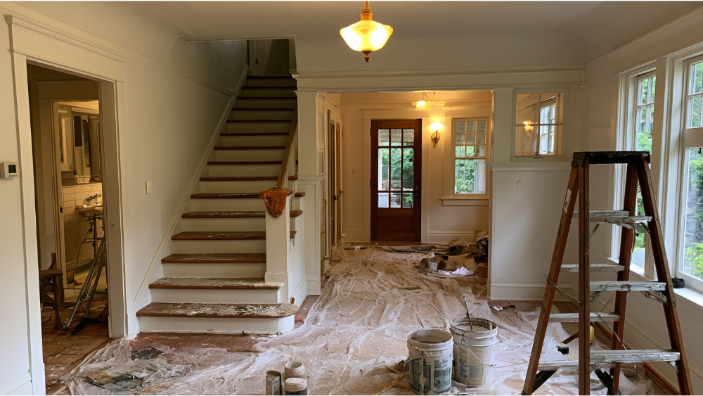
Plenty of homes across the Seattle-Tacoma area were built before 1978, and that matters once prep starts. When sanding, scraping, or repairs disturb old paint, the EPA's Renovation, Repair and Painting rule can apply, because that work can create dangerous lead dust. The EPA recommends hiring a lead-safe certified contractor for these projects. Cover Pro Painting is EPA Lead-Safe Certified (RRP Certified) and licensed, bonded, and insured in Washington State, so older-home prep is handled with the right practices from the start.
Frequently Asked Questions
What is the right paint color for a living room with natural light?
It depends on the direction of that light. Bright south- and west-facing rooms can carry cooler tones, soft neutrals, and deeper accent colors, while cooler north facing rooms do better with warm whites and warm neutrals. Test your top choices in the actual room before deciding.
What color makes a dark living room feel brighter?
White reflects the most light, but stark pure white can go cold in low light. Warm off white tones, gentle neutrals, and higher-LRV hues usually brighten a dim room while still feeling inviting. Light rugs and a mirror opposite the windows help too.
Should I paint a north-facing living room white?
A warm white often works, but avoid stark, blue-leaning whites, which can look cold under north light. Warm whites, creams, and warm neutrals balance the cool daylight better. If you want a bit of color, a warm greige or a soft green with a warm base holds up well and keeps the room feeling cozy in these spaces.
Are light grays a good choice for a living room?
They can be, but light grays are undertone-sensitive. In a sunny south- or west-facing room they read fresh and airy, while in a north-facing space they can drift cool and flat. Check the undertone against your floors and test it on the wall first.
Should living room walls be matte, eggshell, or satin?
Eggshell is the most popular living room choice for its balance of subtle sheen and cleanability. Matte hides wall flaws but is less washable, and satin reflects more light but shows imperfections. Any sheen looks best over properly prepped walls.
Do I need a lead-safe painter for an older house?
If your home was built before 1978 and prep will disturb old paint, yes. The EPA recommends a lead-safe certified contractor for that work. Cover Pro Painting is EPA Lead-Safe (RRP) Certified.
Get Help Choosing a Living Room Color That Works in Your Real Light
The right color is the one that looks good in your room, your light, and next to your floors and furniture, not the one that looked good on a screen. We can help you get there. Cover Pro Painting offers a free color consultation and a free estimate, with clear communication from start to finish, thorough surface prep, and low-VOC, family-safe options for the rooms your family lives in. Based in Edgewood and serving homeowners and businesses across the Seattle-Tacoma area, our team brings over 100 years of combined painting experience to every project.
Ready to choose a color you'll still love in a year? Call us today at 206-222-0435 to get your free painting estimate and start with a plan built around your real light.
