



Dining Room Paint Colors: How to Choose a Color That Works in Your Home
Key Takeaway
The best dining room paint colors are warm whites and taupes for flexibility, muted greens and blues for a calm everyday space, and deeper greens, terracotta, burgundy, or navy for an intimate, dramatic room. Your choice depends on natural light, existing finishes, and how you use the space. Test two to four large samples on your actual walls under both daylight and evening light before committing.
The best dining room paint colors are warm whites and taupes when you want flexibility, muted greens and blues for a calm everyday space, and deeper greens, terracotta, burgundy, brown, or navy when you want a more intimate, dramatic room. The right choice depends on your actual light, the finishes you're keeping, and the mood you're after. Paint shapes whether a dining room feels airy and elegant or cozy and enveloping, which is why we treat color as a decision about your room, not a name on a color card. If you're planning an interior repaint and want to feel confident before you commit, start here.
Start With the Room, Not the Paint Chart
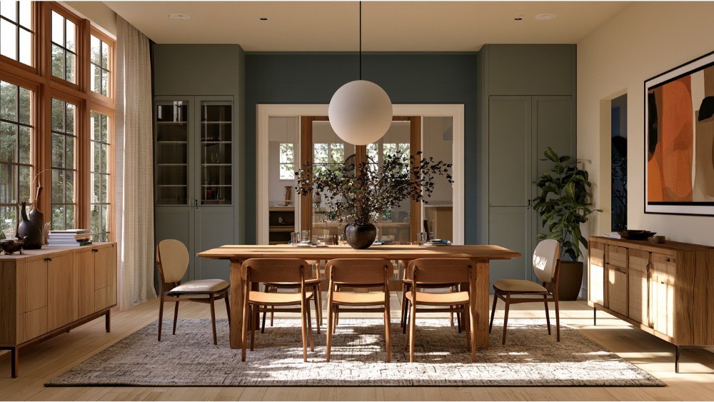
Answering a few questions first turns dozens of swatches into a short list of dining room paint colors that actually belong in your space.
- Do you want the dining space to feel airy, relaxed, warm, formal, or dramatic?
- Is it used mostly during the day or in the evening?
- How much natural light reaches it?
- What flooring, dining table, trim, and built-ins have to stay?
- Can you see the dining room from the kitchen or living room?
Your paint colors should coordinate with what's already in the room and flow with the spaces next to it. Your personal style matters here too, so let it guide the shortlist. Once you know how you want the room to feel and when you use it, most of the color card falls away on its own.
Best Dining Room Paint Ideas by Color Family
Here are eight dependable families of dining room colors worth considering. These are current dining room paint ideas, grouped by family rather than product name so you can match a chip from any brand. For each one, we note what it's best for, what it pairs with, the main risk, and whether it leans toward daytime or evening use.
Warm White, Creamy White, and Off-White
Best for small, shaded, or open-plan rooms, where lighter shades help the space feel open and elegant. A crisp white can be a perfect backdrop for bold art and furniture, while a soft off white or creamy white brings a softer, more forgiving classic look. Warm whites reflect natural light and shift easily as your decor changes, which makes them a safe anchor. The risk is going too cool: a stark or blue-based white can read cold under gray daylight, so favor a creamy or softly warm white.
Greige, Taupe, and Warm Beige
Best for flexibility, especially when the dining room connects to several other spaces. These warm neutrals and soft neutrals hold up as a backdrop on the walls, a taupe with clay and violet undertones adds quiet depth, and a neutral, inviting beige keeps things welcoming. The main risk is undertone: the wrong one can turn muddy, pink, or gray once it's on the wall, which is exactly why sampling matters.
Sage and Muted Olive
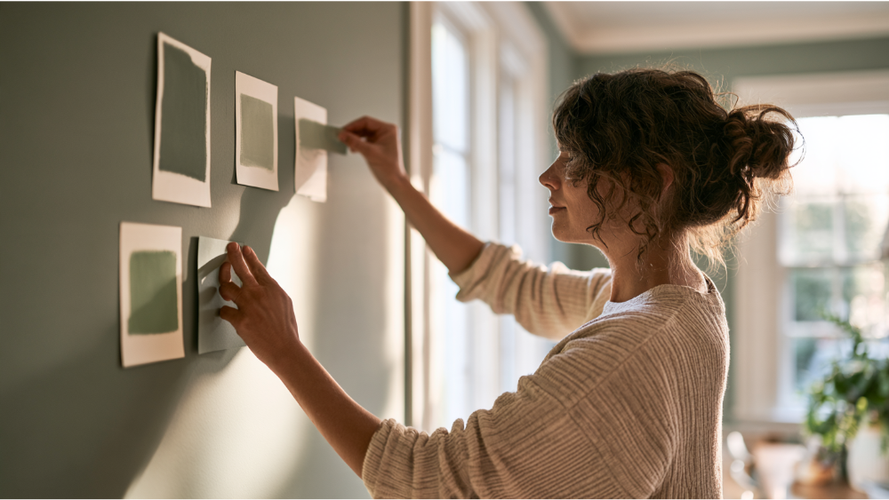
Best for natural, calm everyday rooms. Sage promotes a relaxed vibe and plays well with wood furniture, linen, stone, and black accents. These earthy tones settle a room down without closing it in and give off a calming effect at the table. Watch the yellow-green versions, which can look dull or drab under cooler light.
Forest Green
Best for intimate evening rooms and traditional millwork, where a rich green adds depth and a cozy atmosphere for gatherings. It pairs beautifully with warm wood tones and lighter upholstery, which keeps it from feeling heavy. The risk is that deep green can read almost black in limited light, so it needs either good daylight or a room you plan to use after dark.
Dusty Blue, Navy, and Teal
These blue shades cover a wide spread. A pale blue-gray feels calm and airy and suits a bright room, while a bold, deep navy or teal brings drama and intimacy and makes metallic accents pop. Decide which end of that range matches your mood before you sample. Cool hues and cool tones can make blues feel colder, and artificial light can push teal toward turquoise, so check it at night.
Terracotta and Earthen Clay
Best for warmth and a grounded, inviting room. A muted, inviting orange works with dark wood, black metal, leather, and warm stone, and it creates a welcoming warmth that encourages guests to linger over dinner. The main risk is pairing it with cool gray flooring, where the two undertones can fight each other.
Burgundy, Plum, and Muted Red
Best for formal, evening-oriented rooms. If you love bold colors, a deep red creates a striking, intimate backdrop, and you'll often hear that a warm red stimulates appetite and conversation. Color psychology does influence how a room feels, but there's no reliable evidence that a wall color controls how much people eat, so treat that claim as atmosphere rather than science. The risk is weight: without enough contrast and good lighting, these shades can feel closed in.
Chocolate Brown, Charcoal, and Near-Black
Best for dramatic, modern dining rooms with enough light or a space you use intentionally at night. Charcoal brings a quiet sophistication, and these sophisticated shades on bold dark walls make art, brass, and metal stand out. Balance them with a lighter ceiling, upholstery, or trim. One honest caution: dark colors show every wall flaw, which makes surface prep non-negotiable.
Which Dining Room Color Suits Your Room Condition?
These are strong starting points based on how your room behaves, not rigid rules.
How to Choose Colors Alongside Wood Tones, Trim, and Adjoining Rooms
Your wall color has to live alongside the floors, the dining table, and the trim, so start by reading their wood tones and undertones. Warm woods lean orange or honey and pair naturally with creams, sage, terracotta, and deep green. Cooler woods and gray floors sit better with muted blues and soft neutrals. Painted trim gives you a crisp frame for bolder walls, while natural wood trim asks for a wall color that flatters its undertone. For flow between connected rooms, you don't need to paint everything the same color. Repeat your wall color in artwork, upholstery, or accessories, or share similar undertones across the spaces so they feel related. If the trim, doors, or millwork need attention too, those can be handled in the same project.
Accent Wall, Wainscoting, or All Four Walls?

- Accent wall: works when you have a true focal point or an architectural feature worth drawing attention to.
- Two-tone walls: make sense where a chair rail or wainscoting already breaks the wall into an upper wall and lower section, and patterned wallpaper on one band can add a bit more intimate feel.
- All four walls: the move to create an enveloping or formal effect, especially with deeper paint colors.
- Ceiling color: a deliberate design choice, not an afterthought, and a nice way to add warmth overhead that gives the dining area an intimate feel.
- Color drenching: painting walls, trim, and ceiling in the same shade is an advanced technique that rewards careful execution.
Check Color Psychology, LRV, and How the Color Looks at Night
Light Reflectance Value runs on a 0-to-100 scale, where lower numbers reflect less light and higher numbers reflect more. It's a quick way to compare how light or dark two paint colors will feel, but it tells you nothing about undertone, so a swatch can share an LRV with another and still look completely different on your wall. Warm lighting and color psychology can guide the mood you want, yet lighting changes everything after sunset. ENERGY STAR lists 2700K to 3000K color temperature with a Color Rendering Index above 80 as appropriate for dining spaces. Before you commit, judge your samples under the actual chandelier and sconces at night, not just in daylight.
How to Test the Right Paint Color Before You Commit
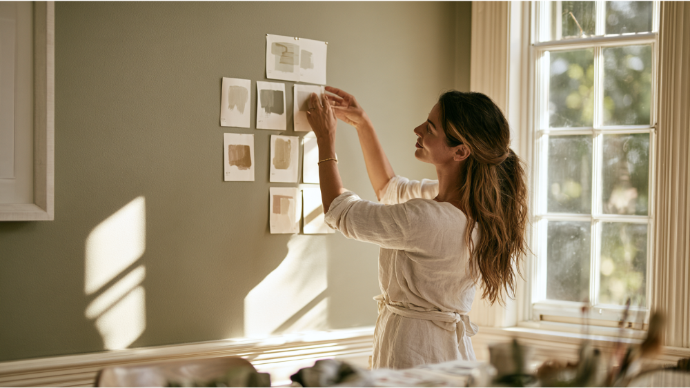
- Narrow your choice to two to four paint colors.
- Create large samples or paint movable sample boards, usually two coats for an accurate read.
- Place them on more than one wall.
- Compare each directly against your flooring, trim, furniture, and drapery.
- View them in morning, afternoon, and evening light.
- Turn on the chandelier and sconces.
- Decide only after you've seen the color under the conditions you actually use the room in.
There's no official number of samples you have to test. This is practical, not a rule. The point is to see the color on your own walls, not on a chip against a white wall, so you land on the perfect color for the room feel and inviting atmosphere you're after.
Why Paint Finish and Surface Prep Matter as Much as Color
Dining walls take fingerprints, chair scuffs, and the occasional food or drink mark, so cleanability matters. Higher sheen wipes down well but reveals more wall flaws and can make a color look more saturated. That's why surface preparation comes first: patches, dents, stains, failing coatings, and trim damage should be handled before a drop of color goes up, especially under dark or glossier finishes where every imperfection shows. Eggshell and satin are common choices, and a lower sheen can help hide minor flaws. Proper prep with premium products is what delivers a flawless finish and clean, long-lasting results. For more on sheen, see our guide to satin finish paint.
A Note for Seattle-Tacoma and Pre-1978 Homes

Seattle-Tacoma gets roughly 47% of its possible annual sunshine, dropping into the low-to-mid 20s% in late fall and winter. Dining room colors that look warm and bright in July can appear flatter, cooler, or grayer under December daylight. Test your samples under overcast daylight as well as warm evening light so you aren't surprised when the seasons turn. For homes built before 1978, sanding, scraping, or repairing old painted surfaces can trigger lead-safe practices under Washington's EPA-authorized RRP program. We're EPA Lead-Safe (RRP) Certified, so that work is handled correctly from the start.
When a Professional Color Consultation Helps You Choose Colors
Expert help pays off when the decision gets complicated:
- The room has conflicting wood or flooring undertones.
- Several adjoining spaces need to coordinate.
- You're considering a very dark or bold color.
- Trim, ceiling, doors, or millwork will also be painted.
- The walls need real repair before paint.
- Your home was built before 1978.
We're a founder-led team based in Edgewood, and every painting project includes a free color consultation along with a transparent estimate, proper surface prep, and premium paint products that hold up over time. Start with a free estimate and color consultation to see exactly what your dining room project will involve. Call us at 206-222-0435 to get a free estimate.
Frequently Asked Questions
What is the best color to paint a dining room?
There's no single best dining room paint color. Warm whites and taupes offer the most flexibility, muted greens and blues feel calm for everyday use, and deep green, navy, burgundy, or brown create an intimate room. Match the color to your light, your existing materials, and the mood you want.
What are some good dining room colors for walls?
Warm white, greige, sage, forest green, navy, terracotta, burgundy, and charcoal all work well. The lighter neutral shades keep a room open and airy, while the deeper, bolder tones make it feel cozy and enveloping for guests.
What are some good dining room paint ideas for 2026?
Current inspiration leans toward warm earth tones, greens, deep blues, and moody rooms, balanced by warm neutrals in smaller or connected spaces. Trends shift, so treat these paint ideas as a starting point and test any color in your own room before committing.
What type of dining room paint is best?
A washable premium interior coating suited to your wall condition. Eggshell and satin are common picks, and a lower sheen can help hide minor flaws. Whatever finish you choose, prep the surface first. See our satin finish paint guide for more.
