
%201.svg)


Best Paint Colors for a Living Room That Actually Gets Used

Key Takeaway
The best paint colors for a living room that actually gets used are warm neutrals, greige, muted greens, and soft blues - chosen for how your specific room handles light, traffic, and daily wear. Mid-tone shades in an eggshell or satin finish hide fingerprints and scuffs far better than stark white or very dark walls. Always test large samples in the room across morning, midday, and evening light before committing.
For a living room you actually live in, the most reliable living room paint colors are warm neutrals, soft greige and taupe, muted greens, soft blues and blue-greens, and grounded darker neutrals used with intention. Warm whites, muted greens, and airy blues create a comfortable, inviting feel, while soft neutrals like beige and cream stay flexible and easy to live with. But the best living room paint depends less on the name on the chip and more on your room's light, furniture, wall condition, and finish. So test paint samples in the room before you commit. This guide is written for the living room where TV nights happen, where kids and pets share the couch, and where guests actually sit down, not the one staged for a photo.
Start With How You Actually Use the Living Room
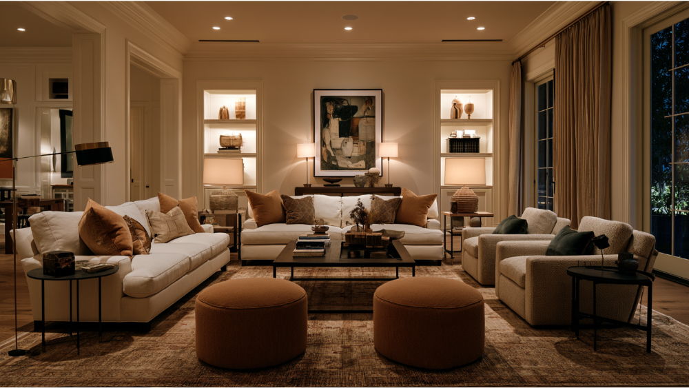
Before you look at a single paint color, look at how the room gets used. A busy family room and a formal sitting room have almost nothing in common when it comes to color and finish. One takes daily abuse. The other rarely gets touched.
Real living rooms have real variables. There's TV glare that fights with certain sheens. There are kids' hands on the living room walls, pets brushing past the baseboards, and furniture that rubs the same spot for years. In open-concept homes, foot traffic runs through the space all day, and daylight shifts from morning to evening. All of that shapes the answer.
Use dictates two things at once: how deep a shade you can live with, and which finish will hold up. A room that works hard usually wants a forgiving mid-tone and a finish you can wipe down. A living room that's mostly decorative gives you room to play with bolder living room colors. Start there, and the color decisions get a lot easier.
The Best Living Room Paint Color Families for Real Life
The color families below earn their spot because they hold up to daily use and flatter most furniture and light. Warm colors like beige and soft gray-green balance style with easy upkeep, and soft neutrals work with nearly any design style. Here's how each one performs when the room is actually being used, along with a few popular living room colors that interior designers reach for again and again.
Warm Whites and Soft Creams: Chantilly Lace and Beyond
Warm whites and a creamy white stay bright and flexible without feeling clinical. Neutrals like beige and cream work with any design style, and a crisp white can make a small living room feel larger and brighter. A widely referenced example is Benjamin Moore Chantilly Lace, a warm-leaning white that reads clean without going cold. Another go-to is Benjamin Moore White Dove, a soft off-white that flatters both walls and trim. Sherwin Williams offers similar soft whites that keep a modern, airy look without the glare of a stark bright white. The caution: pure whites can wash out in strong daylight, and in a high-touch family room they show scuffs and fingerprints faster than almost anything else. Choose a warm white with a little softness in it if the space works hard.
Greige, Taupe, and Warm Neutrals
This is the forgiving default, and for most family rooms it's the smart first pick. Greige, taupe, and warm neutrals hide everyday wear, work with most furniture and wood tones, and create easy flow between adjoining spaces. Warm undertones keep a room cozy and inviting, which matters most in rooms that don't get much sun. Both Benjamin Moore and Sherwin Williams carry deep benches of these shades, so it's easy to match the exact undertone your space needs. These living room colors don't fight with a gray sofa or a beige one, and they sit comfortably next to both light and dark wood. If you want one palette that flatters neutral furniture and forgives daily life, start here.
Muted Greens, Sage, and Olive
Muted greens bring the outdoors in without shouting. An earthy green like sage or olive feels calm and grounded, and a soft gray-green balances style with low maintenance. These tones are having a real moment in modern living room paint, and they're livable, not trendy for the sake of it. Sage green also performs well across rooms in resale data (more on that below). Muted greens hold up in both bright and softer light, which makes them one of the more dependable living room paint colors for a space that changes character through the day.
Soft Blues and Blue-Greens
Soft blues and blue-greens feel calm without feeling plain. A gentle blue creates a soothing atmosphere, and airy blue-greens read comfortable rather than cold. Shades with blue undertones are especially useful for balancing strong south-facing light, where cooler tones settle down harsh brightness. Pale blue also happens to be a standout in recent resale research, which we'll get to. If your living room gets a lot of direct sun and warm neutrals feel flat, a soft blue-green gives you a calm, welcoming space without going stark.
Charcoal, Deep Taupe, and Grounded Dark Neutrals
Deep colors aren't just for dramatic magazine spreads. In a larger room, a charcoal gray or deep taupe makes the space feel more intimate when it's paired with good lighting and enough contrast in the trim and furniture. Rich hues create a cozy, enveloping feel, and a bold hue on a dark wall can anchor a modern living room beautifully. A few black accents in the hardware or fixtures add a luxurious touch that keeps deeper walls looking intentional. Charcoal gray also shows up strongly in resale data. The trick is balance: in a small, low-light room, a dark wall can close things in and feel heavy. Give a dark color room to breathe, plenty of light, and lighter accents, and it reads rich instead of cramped.
Color With Restraint: Terracotta, Dusty Rose, and Accent Walls
You can have character without regret. Muted terracotta, dusty rose, and plaster pink add warmth and a bit of personality, and a warm tone like this creates an intimate, cozy feel. A hint of soft yellow can do the same, adding sunlight to a north-facing space without overwhelming it. If a full room of more color feels like too much, put a bold shade on a single accent wall instead. The one rule: an accent color has to tie into the room's overall color scheme, not fight it. Pull the accent paint color from something already in the room, a rug or artwork, and it feels intentional rather than random.
How Does Natural Light Change Your Living Room Paint Color?
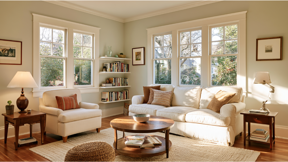
Natural light changes how paint reads more than most people expect, and it's the reason a color can look perfect on the chip and wrong on the wall. The direction your windows face is the first thing to check.
North facing rooms get cooler, flatter light, so they benefit from warmer, lighter colors that push back against the chill. A soft yellow or warm greige can make that kind of space feel more inviting. South-facing rooms get warm, steady light all day, which enhances warm tones and can handle more saturated color, while a cooler gray or blue-green helps balance strong sunlight. Rooms flooded with sun can carry deeper, richer shades that would feel dark elsewhere. Low-light rooms do best with warm whites, soft taupes, and higher-reflectance colors that make the space feel open. The same wall color can shift noticeably as lighting conditions change through the day.
That reflectance idea has a name: Light Reflectance Value, or LRV. It's a 0 to 100 scale where higher numbers reflect more light and lower numbers absorb more. A low-LRV paint color in a dark room can feel like a cave. A high-LRV color in a bright room can wash out. It's a quick sanity check on whether a color will feel too dark or too flat before you buy a gallon.
Your bulbs matter too. Warm LEDs and incandescent-style bulbs make colors read warmer at night. That's exactly why you test paint samples in the actual room, in real light, before you decide.
Match the Color to Your Furniture, Flooring, and Trim
Your walls don't live alone. The paint color has to agree with the biggest fixed elements in the room: your flooring, your sofa, your trim, and anything you're not replacing.
Start by reading undertones. Warm undertones lean yellow, red, or brown. Cool undertones lean blue, gray, or green. Hold a color against your wood floors, your fireplace surround, and your built-ins. If the wood is warm and honey-toned, a warm greige or muted green sits comfortably next to it. A gray sofa usually wants cooler or truly neutral walls, while a beige or leather sofa pairs better with warm neutrals. Rugs are a great cheat sheet, since they often carry the exact undertones you want to echo on the walls. Your decor gives you the same clues, so let it guide the color selection rather than fighting it.
In an open floor plan, color flow matters. Neutral living room colors create smooth transitions between adjoining spaces, and a cohesive palette between the living room and dining room keeps the whole level feeling connected rather than chopped up. Using different walls to shift tone slightly can add depth without breaking that flow. Pick undertones that agree with your largest permanent features, and the color scheme stops feeling like a gamble.
The Paint Finish Matters as Much as the Color

The finish you choose affects durability, glare, and how much the paint hides or reveals your walls. In a living room that gets used, this decision carries as much weight as the color itself.
If you watch a lot of TV, a lower-sheen finish cuts glare on the wall behind the screen. If your walls have flaws you're not fixing, avoid glossier finishes that spotlight every dent. Washable, stain-release formulas (found in mid-tier premium lines) make cleanup easier, and ultra-premium lines hold their color depth longer. Most walls need two coats for even coverage, and an eggshell finish is the sweet spot for most living rooms. We stick to premium paint products backed by lifetime manufacturer warranties, matched to how each room actually gets used.
Which Living Room Colors Hide Everyday Wear Best?
Mid-tone warm neutrals, muted greens, and greiges hide fingerprints, scuffs, and pet marks far better than stark white or very dark walls. White shows every smudge. Very dark walls show dust, lint, and any spot where furniture has rubbed. A forgiving mid-tone shade sits in the sweet spot where daily life mostly disappears.
Keep in mind that "washable" depends on three things: the paint product, the finish, and whether the paint has cured. A quality eggshell or satin in a warm mid-tone will take a wipe-down without complaint once it's had time to harden. And the finish only performs the way it should when the wall underneath was properly prepped and painted with a durable product. That's what makes clean, long-lasting results possible in a room your family actually uses.
What to Avoid in a Hard-Working Living Room
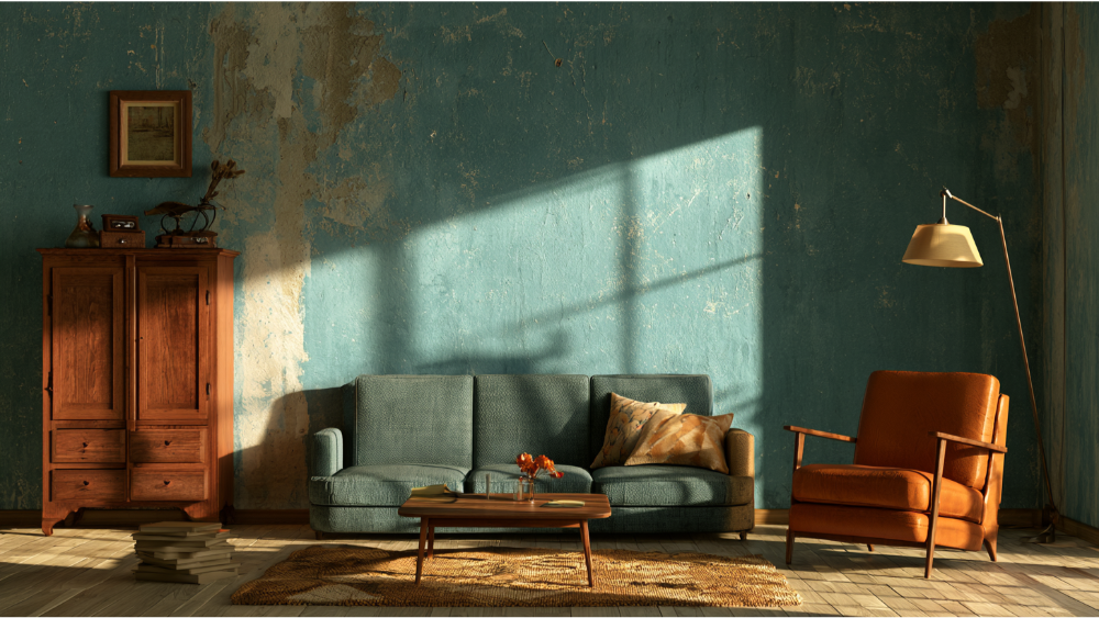
A few common mistakes turn a fresh paint job into a short-lived one:
- Stark white in a high-touch family space unless it's a deliberate design choice you're ready to clean often.
- Committing to a trend color without testing it in your own light and against your own furniture.
- Too much contrast in a small room, which chops up the space and makes it feel smaller.
- Glossy finishes on imperfect walls, which put every flaw on display.
- Skipping surface prep, the single biggest reason a good paint color still looks wrong.
How Do I Test Paint Colors Before I Commit?
Testing samples is the step that saves you from a paint color you regret. It lets you find the perfect hue by seeing how a shade actually behaves in your room's changing light before you paint the whole wall
- Use large sample boards or paint a good-sized section of the actual wall, not a tiny square.
- Look at it in morning, midday, and evening light, plus under your lamps at night.
- View the sample right next to your trim, your couch, your flooring, and your art.
- Test the finish too, since sheen changes how the color reads.
Never choose from a chip alone. Whether you're comparing a Benjamin Moore green against a Sherwin Williams greige, a chip lies about how a color will feel across a whole wall in your specific light. Viewing candidates under different lighting conditions is the only honest test.Safety and Comfort: VOCs, Ventilation, and Older Homes
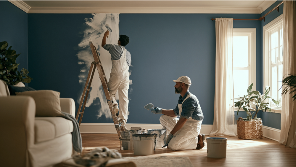
Paint isn't only about looks. If your family uses the room soon after painting, air quality and older-home safety are worth understanding.
VOCs are chemicals that evaporate at room temperature. Green Seal generally considers flat paints under 50 grams per liter low-VOC, non-flat paints like satin and semi-gloss low-VOC under 100 grams per liter, and paints under 5 grams per liter zero-VOC. The EPA recommends plenty of fresh air and ventilation while painting, and it notes that indoor levels of some common organic pollutants have measured 2 to 5 times higher indoors than outdoors.
Cure time matters too. Some products can be used lightly after about 24 hours but may take around 30 days to fully cure, and one manufacturer suggests waiting at least two weeks before scrubbing painted walls with soap and water. Always check the product guidance and your painter's recommendation, since it varies with humidity, temperature, and ventilation.
If your home was built before 1978, roughly three-quarters of that housing contains some lead-based paint, and the EPA requires certified, lead-safe practices when work disturbs more than 6 square feet of interior surface (or 20 square feet outside). Cover Pro Painting is EPA Lead-Safe (RRP) Certified, which matters any time sanding, scraping, or repair is part of the job.
Why Surface Prep Changes How the Final Color Looks
Surface prep is what makes a paint color look right and last. Paint doesn't fix a wall. It magnifies whatever's underneath it. Skip the prep, and even a perfect color reads uneven and disappointing.
Good surface preparation means patching holes, sanding rough spots smooth, cleaning off dust and grease, caulking gaps, and priming where needed. Old water stains and fresh drywall repairs can flash through a topcoat if they aren't sealed first, leaving dull or shiny patches that catch the light. Wall texture and sheen also change how a color reads, so two walls painted the same shade can look different if one wasn't prepped properly.
This is where craftsmanship shows. We lead every project with surface prep because it's the difference between a color that looks good in week one and one that still looks right years later, whether we're painting one room or the whole house. Proper prep, premium products, and attention to detail are what deliver the flawless finish you're actually paying for.
Frequently Asked Questions
What living room paint color hides scuffs best?
Mid-tone warm neutrals, greiges, and muted greens hide fingerprints, scuffs, and pet marks better than stark white or very dark walls, especially in an eggshell or satin finish.
Is eggshell or satin better for living room walls?
Eggshell is the practical default for most living rooms, balancing durability with a softer look. Satin is more washable and scuff-resistant for high-traffic spots, but it reflects more light and shows wall imperfections more readily.
What living room paint colors are best for resale?
Zillow's 2026 analysis of more than 4,400 buyers found pale blue living rooms tied to offers about ,723 higher than white, and charcoal gray about ,509 higher, with sage green ranking well across every room. Treat this as resale data, not a rule for what you'll enjoy living with day to day.
How long should I wait before cleaning newly painted walls?
Some paint can be used lightly after about 24 hours but may take around 30 days to fully cure, and one manufacturer recommends waiting at least two weeks before washing walls with soap and water. Always check the product guidance and your painter's recommendation.
Do I need lead-safe practices in an older home?
If your home predates 1978 and the work disturbs more than 6 square feet of interior painted surface, the EPA requires certified, lead-safe practices. Cover Pro Painting is EPA Lead-Safe (RRP) Certified for exactly this reason.
Ready to Choose a Color With Confidence?
The right living room paint color comes down to your light, your furniture, your walls, and how the room actually gets used, and it looks its best only when the prep underneath is done right. We include a free color consultation with every project, handle the surface prep that makes the color last, and give you a clear, transparent estimate before any work begins. Based in Edgewood, WA, we serve homeowners and businesses across the greater Seattle-Tacoma area. Call 206-222-0435 or reach out to get your free painting estimate.
