
%201.svg)


Bedroom Paint Ideas Beyond the Usual Neutral
Key Takeaway
Bedroom paint ideas beyond the usual neutral include muted blue-green, sage, clay, terracotta, dusty rose, mauve, plum, burgundy, chocolate brown, and deep navy - colors that add character while keeping the room restful. Cool tones like blue and green are especially calming. Test large sample boards in morning and evening light before committing, and treat surface prep as the foundation of any bold color choice.
If you want a bedroom color that has personality but still feels calm, the answer is to reach for expressive but grounded paint colors: muted blue-green, sage, soft clay, terracotta, dusty rose, mauve, plum, burgundy, chocolate brown, or deep navy. These add character while keeping the room restful, especially cool tones like blue and green that many people find relaxing. The trick is simple. Choose the mood you want first, test large samples in your own light, and make surface prep part of the plan. That's how we help homeowners land bedroom paint that looks intentional, not impulsive.
Why Go Beyond Neutral in the Bedroom?
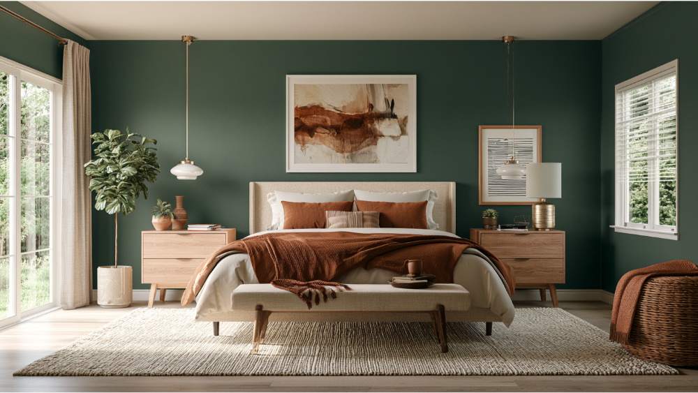
Neutrals are safe, and a soft beige or greige can absolutely make a room feel cozy. But neutrals aren't the only restful path, and your bedroom is the most personal room in the house. It's the one space that gets to be entirely about how you want to feel when you wake up and when you wind down.
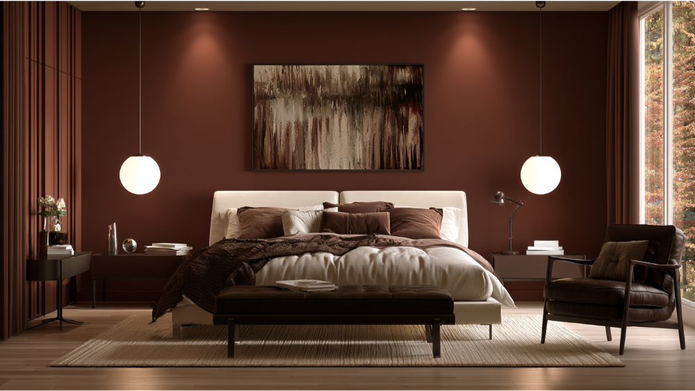
Current design direction has moved toward warm tones and earthy tones. Blue-greens, chocolate browns, burgundy, sage, and smoky hues are showing up on bedroom walls everywhere, replacing flat beige with something more expressive. Going bold with color doesn't mean going loud. When a color is muted and grounded rather than bright, "beyond neutral" still reads as calm and livable. That's the whole point.
Start With the Mood You Want, Not the Paint Chip
Before you fall for a paint chip, decide how the space should feel. The color follows the mood, not the other way around. Cool hues like blue and green tend to relax people, while deeply saturated shades create drama. Here's a quick way to sort your bedroom color options:
- Calm and airy: soft blues, the palest greens, misty grays with a hint of color, and other light colors that keep a room feeling open.
- Cozy and cocooning: clay, dusty rose, warm terracotta.
- Romantic and moody: mauve, muted plum, burgundy.
- Fresh and nature-inspired: sage, olive, forest green.
- Playful but grown-up: muted mustard, a touch of soft yellow, a whisper of orange, or gentle accents that lift a neutral base.
Pick the bucket that matches how you want to feel, then narrow to two or three paint colors inside it. That one decision saves you from second-guessing a wall of swatches and helps you build a palette you'll live with happily.
10 Bedroom Paint Colors That Aren't the Usual Neutral
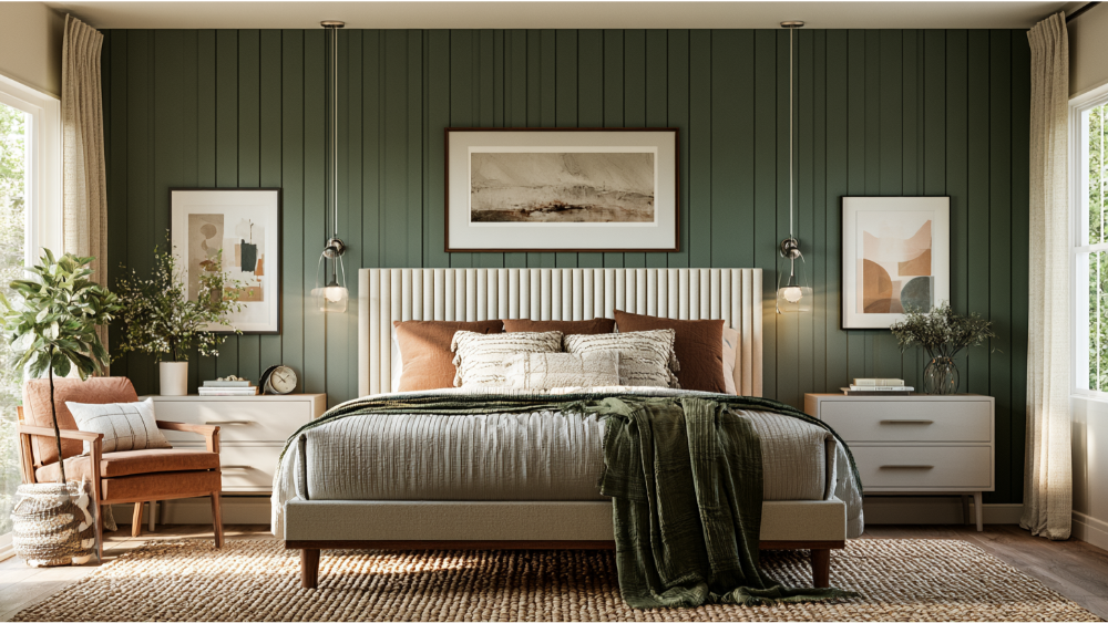
Here are ten color families worth considering, with what each one feels like, where it works best, and how far to take it on your bedroom walls. Use them as ideas and inspiration, then adapt each to your own style.
- Smoky blue-green: Soft and grounding, the kind of color that quiets a room. Works in most light levels. Pairs beautifully with warm wood furniture and white bedding. Beautiful as a full-room color or on all four walls.
- Muted sage or olive: Organic and forest-like, one of the more calming colors without being cold. Great in rooms with decent daylight. Pairs with natural linen and brass accents. Try it full-room or as a headboard wall.
- Soft clay or terracotta: Warm and welcoming, like afternoon light held on the wall. Ideal for cozy or north-facing rooms. Pair with cream and rattan. Strong as a full-room wrap.
- Dusty rose: A soft pink that adds warmth without feeling sweet. Flattering in almost any light, it's a great example of a color that welcomes rather than shouts. Pairs with warm grays and wood tones. Works full-room or on a single accent wall.
- Mauve or muted plum: Romantic and a little moody, restful in the evening. Best in primary bedrooms. Pair with charcoal and soft white. Consider color drenching for a cocoon effect.
- Burgundy or wine: Rich and enveloping, deeply cozy at night. Suits low-light rooms you want to feel intimate. Pair with cream and gold accents. Powerful as an accent wall or a drenched room.
- Chocolate brown: Warm, grown-up, and surprisingly restful. Great in larger or well-lit bedrooms. Pairs with tan, ivory, and warm wood. A confident full-room choice.
- Deep navy: Creates a cozy, cave-like effect many people find good for sleep. Works in most rooms with soft lighting. Pair with brass and crisp white. Try it on all walls or the ceiling.
- Forest green: A rich, calming nod to nature. Best with some natural light to keep it lively. Pairs with cream and warm metals. Strong full-room or on a feature wall.
- Warm white with a bold ceiling or painted trim: Keeps walls light while adding personality overhead or on the trim. Works in small or dark rooms. Pair the trim shade one step deeper than the walls for a custom look.
One Wall, Every Wall, or the Whole Ceiling?
How far you take the color changes the whole feel. An accent wall is the lowest-risk option: one feature wall, usually behind the bed, with the rest kept neutral. Full-room color wraps all four walls in the same shade and reads as intentional and enveloping. Color drenching means painting the walls, trim, and ceiling the same bold color, which erases hard edges and makes a room feel like one continuous space.
You can also just paint the ceiling for a soft canopy effect, go two-tone by dividing the upper and lower wall, or paint the trim one shade darker than the walls. In small or busy rooms, keep bold paint to one feature so the room doesn't close in. Whichever route you pick, clean cut lines are what separate a custom look from a rushed one, and that precision is where our attention to detail shows.
How Natural Light Changes Bedroom Paint Color
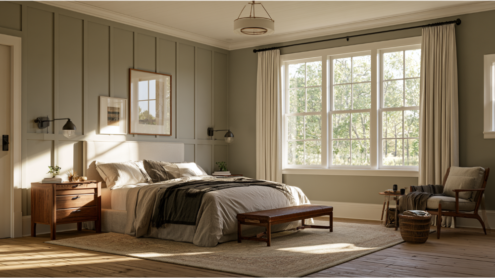
The same color can look like two different paints from morning to evening. Daylight cools and flattens a shade, while warm evening light deepens it. That's why a color you loved on a screen can land completely differently on your bedroom walls, and why the same hue can feel like two personalities at different times of day.
A helpful term here is LRV, or Light Reflectance Value. It tells you how much light a color reflects. Higher LRV reads lighter and airier, so a lighter shade brings refreshing energy to a room, while a lower LRV reads deeper and moodier. Here in the Pacific Northwest, overcast days can cool down blues, greens, and gray tones, so a color that looks warm online can read colder on the wall. That's one more reason to paint large sample boards and prop them in the actual room, checking them in morning and evening light before you commit. It's the cheapest insurance against buyer's remorse.
Adjusting for a Small Room, a Guest Bedroom, or a Dining Room Next Door
The right paint colors depend on the room's job and its conditions. And because a bedroom rarely sits in isolation, it helps to think about how your palette flows toward an adjacent hallway, dining room, or shared living space so the whole home feels connected. The right finish and the right decor complete the sense of a cohesive home.
- Small bedrooms: Soft, muted, cohesive colors help walls recede, and low contrast makes the space feel larger. A deep drenched color can also make a small room feel cozy and intentional rather than cramped.
- Low-light bedrooms: Test undertones carefully. Grays and greens can turn muddy without much natural light, so sampling is essential.
- Guest bedrooms: Choose calm, flexible warm neutrals and soft colors that welcome anyone. A guest room is a great place to keep wall colors easygoing and save the most personal shades for your own room.
- Primary bedrooms: You have the most room for mood and personality here. This is the place to try burgundy, navy, or a drenched plum, the kind of bedroom colors that let you shut out the outside world and rest.
The Finish Matters as Much as the Color
Color gets the attention, but sheen decides how the finish reads. Choosing the right finish is as important as landing the perfect hue. Flat and matte finishes soak up light, read soft, and hide minor imperfections, which makes them forgiving on older walls. Eggshell is a popular bedroom paint choice because it adds a subtle sheen and wipes clean while still staying gentle. Satin gives more shine and durability but wants a smooth surface underneath.
Here's the catch: higher sheen and darker colors reveal every flaw. Uneven texture, sloppy patching, and bad cut lines all show up under a satin navy in a way they never would under a flat beige. The finish only looks flawless when the wall beneath it is properly prepared, which is exactly why we treat surface prep as the real foundation of the job.
Before You Paint: Prep, Primer, VOCs, and Older-Home Safety
A bold or dark color lives or dies on what happens before the first coat. That means cleaning the walls, repairing damage, sanding, patching, and priming where needed, especially when you're going light-to-dark or dark-to-light and coverage matters. Skip that work and the color will show every shortcut.
Air quality is part of the plan too. We use low-VOC, family-safe paint products and keep the room ventilated, since the EPA advises fresh air while painting. Airflow still matters even on cooler, wet days here, so we schedule with that in mind. If your home was built before 1978, the paint underneath may contain lead, and disturbing those surfaces calls for lead-safe practices. Cover Pro Painting is a licensed, bonded, and insured Washington contractor and EPA Lead-Safe (RRP) Certified, so older-home projects are handled the right way.
When to Bring in a Professional

Plenty of painting projects are DIY-friendly. These usually aren't:
- Switching dark-to-light or light-to-dark, where coverage and bleed-through get tricky.
- Walls that need patching, texture repair, or stain blocking.
- Painting trim and doors with crisp, clean edges.
- Homes built before 1978 that need lead-safe handling.
- Anyone who wants clean, long-lasting results without managing the whole process.
Because we're full-service, any rot, siding damage, or carpentry issue we find during prep gets handled by the same team. You won't have to line up a separate contractor to fix a soft window frame before we can paint it.
Frequently Asked Questions
What color is replacing beige in 2026?
Warmer, earthier tones are taking over: soft clay, terracotta, mushroom and warm greige, muted greens, and chocolate browns. Think of them as beige's cozier, more expressive cousins, and lean on them when you want neutrals with a little more life.
What is the most popular paint color for bedrooms?
Blue remains the world's favorite bedroom color. Muted blues and deep navy are especially popular for their calming, cave-like restfulness, though the right shade always depends on your room and light.
What is the 60-30-10 rule for bedrooms?
It's a balance guide for decorating: about 60% dominant color (your walls), 30% secondary (bedding and large furniture), and 10% accents (pillows, art, a rug). It keeps a palette cohesive without feeling flat, and it's a classic starting point for anyone planning a bedside table or nightstand vignette.
What is the color trend for bedrooms in 2026?
Warm, earthy, nature-inspired, and moody hues lead the way, from blue-greens and sage to terracotta, mauve, burgundy, and chocolate brown, often paired with strategic warm whites and quiet neutrals.
How do I test a bedroom paint color before I commit?
Paint large sample boards or swatches, then view them in your actual room morning and evening. Compare each against your bedding, flooring, and trim before you decide.
Get Help Choosing the Right Bedroom Wall Colors
Picking wall colors you'll still love in two years is easier with a second opinion. Every project includes a free color consultation, and we back it up with premium paint products, thorough surface prep, and low-VOC, family-safe options. You get a transparent estimate up front and clean, long-lasting results on your walls, ceilings, trim, and doors, whether we're helping you create a restful bedroom or refresh a dining room down the hall. For older homes, our EPA Lead-Safe Certification means the work is done safely, and if damage turns up, our rot repair and carpentry team handles it in the same visit. That's how we help you build the room of your dreams without juggling multiple contractors.
Start with a free estimate and see exactly what your project will involve. Get My Free Painting Estimate, or call us today at 206-222-0435.
