
%201.svg)


Bedroom Paint Colors That Actually Help You Sleep Better
Key Takeaway
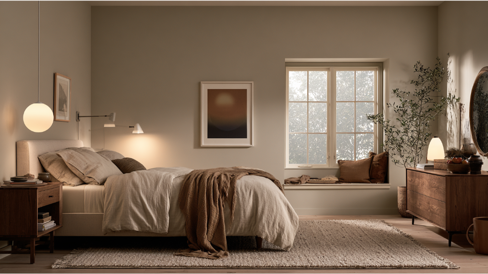
Soft, muted bedroom paint colors like light blue, blue-gray, sage green, and warm greige lower visual stimulation and help your room feel calmer at bedtime. Bedroom paint colors that actually help you sleep better work indirectly through mood and relaxation, not as a medical fix. Keep saturation low across all four walls, since bright or vivid shades can raise heart rate and leave you feeling wired when you need to wind down.
If you want a bedroom that helps you wind down, reach for soft, muted, low-saturation colors: light blue, blue-gray, sage green, warm off-white, greige or taupe, and gentle muted lavender or blush. These shades lower visual stimulation and set a calmer tone before bed. No paint color guarantees better sleep. What the right color does is support a room that feels relaxing to walk into and still looks good years later. If you're planning a bedroom repaint and want a space that feels quiet without repainting again soon, the color family matters less than keeping it soft and easy on the eyes.
Can Bedroom Paint Color Really Help You Sleep?
Paint color affects sleep indirectly, through mood and relaxation, not as a medical fix. Color psychology suggests softer shades reduce visual noise and help you feel less keyed up at bedtime, while there's limited direct research linking a specific wall color to measurable sleep outcomes. So it's fair to say calming colors can help set the stage, but they won't do the work of a dark, quiet, cool room. Health agencies like the NIH and NIOSH point to a bedroom kept around 65°F to 68°F and free of light and noise as the real foundation, and steady white noise helps some people who have trouble sleeping. And small improvements matter: in 2024, about 30.5% of U.S. adults slept less than the recommended 7 hours a night. If your room already fights you at bedtime, the color you choose is one honest step, not a cure. Still, the feelings a room stirs up when you walk in at night are real, and the right shade helps that first impression feel restful instead of jarring.
The Simple Rule: Choose Muted, Low-Saturation Bedroom Colors
Here's the thesis of this whole article: keep the color muted. Saturation is how intense or pure a color is, brightness is how light or dark it reads, and undertone is the subtle hue hiding underneath (a beige that leans pink, a gray that leans green). Bright, high-saturation colors can be stimulating and may nudge up heart rate and blood pressure, which is the opposite of what you want at bedtime. That's why soft blue behaves nothing like bright cobalt, and sage feels restful where neon green feels loud. Muted shades soften psychological responses so the room settles you rather than winds you up. When you want to promote relaxation, the softened version of almost any color does more than the vivid one.
A cross-cultural study of 4,598 people across 30 nations found that many color-emotion associations are widely shared, while also confirming they're shaped by culture and personal experience. In plain terms: certain colors feel calming to most people, but your response is still your own. This is where color psychology stops being a rulebook and starts being a starting point. Pick a color you find restful, then keep it soft and grayed down.
The Best Colors for Your Sleep Space

These five families give you a calm, low-stimulation space while leaving plenty of room for your own taste. Each works best in its muted, softened version, and each is a strong candidate for the best colors when your goal is a good night's rest rather than energy. The right color scheme sets up a sleep space that supports restful sleep from the moment you walk in.
Soft Blue and Blue-Gray
The color blue is the shade most often recommended for sleep, and for good reason. Soft blue tones read as calm and airy, and they're associated with a slower, more settled feeling at the end of the day. Some research links blue bedrooms with better sleep quality and a slight easing of heart rate and blood pressure. The key is restraint. A gentle, dusty blue or a blue-gray keeps the space quiet and helps reduce stress, while a deep saturated navy across every wall can feel heavier and closer than you'd expect. Among paint colors chosen to lower stress levels, soft blue is hard to beat.
Sage and Muted Green
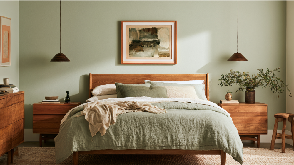
Green pulls the calm of nature indoors. It's tied to tranquility and a sense of emotional ease, and muted sage in particular tends to feel peaceful and grounded. These earthy tones prevent overstimulation while still keeping the room warm and alive rather than sterile. As with blue, the version matters: a dusty sage soothes, where a bright, high-saturation green does the opposite. Few shades create the settled, restful feelings that a grayed-down green does.
Warm White and Cream
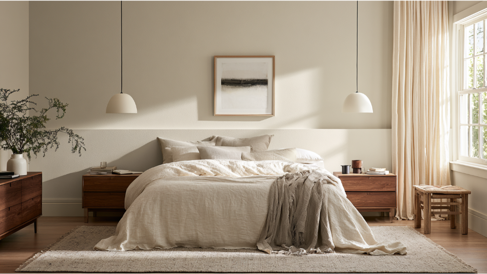
White is often reported as one of the most restful bedroom colors, and soft whites and warm creams are the easy way to get there without a room that feels like a clinic. A warm off-white reads softer than a stark, cool bright white, and lighter colors open up small or low-light rooms. Skip the harsh, blue-based whites for a bedroom; they can feel cold and a little stark at night.
Greige and Warm Taupe
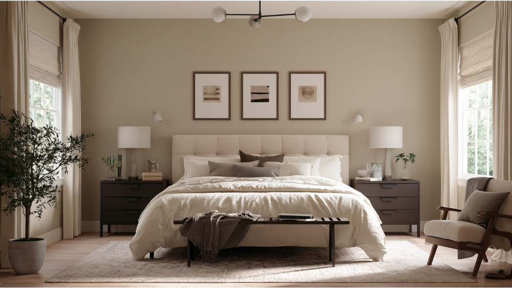
Greige (gray plus beige) and warm taupe give you a grounded, cozy backdrop that flexes with whatever bedding or bedroom decor you bring in. Plain beige can fall flat and feel dated, so the trick is choosing a warm greige with the right undertone for your light. Done well, it's the neutral that stays calm and never fights the rest of the room.
Dusty Lavender and Soft Blush
These are the gentle, personal picks. A soft blush or light pink promotes a feeling of comfort and warmth, while a dusty lavender reads quiet and restful. Both only work when they're kept muted. A light pink kept pale and grayed feels soothing, but bright, saturated purple or hot pink turns stimulating fast. If you love a darker, moody room, darker shades like a deep navy or charcoal can work for some people when they're balanced with soft lighting and lighter shades on the trim, though such darker colors feel heavy to others, so test them before you commit to the whole room.
Blue Paint Is Not the Same Thing as Blue Light
This trips people up, so it's worth being clear. Blue walls can feel calming because of how we associate the color. Blue light is a separate thing entirely. Specialized receptors in your eyes are sensitive to blue-wavelength light, and CDC/NIOSH notes it has the strongest effect on your circadian clock, which is why screens and cool LED bulbs can make it harder to fall asleep. So a soft blue wall won't keep you up, but scrolling your phone in bed might. The CDC suggests turning off devices at least 30 minutes before bedtime. Warm, dimmable lighting at night helps your sleep environment far more than the paint color does.
Worst Bedroom Colors to Avoid If Sleep Is the Goal
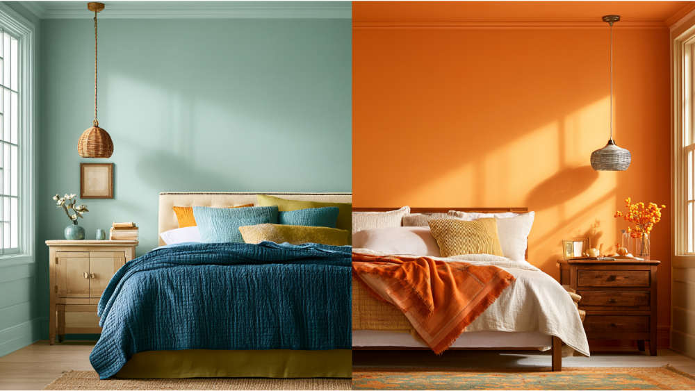
Certain colors work against rest. The color red is the clearest example; high-saturation reds and vivid oranges raise heart rate and blood pressure and can leave you feeling energized right when you're trying to slow down. Intense yellow can be too stimulating for a bedroom, and bright orange heightens that same sense of excitement. A softened, buttery yellow can work as a gentle accent, but a bright yellow across every wall fights sleep. The color black, used heavily, can make a space feel smaller and closed in, and a dark brown room can read gloomy rather than cozy and stir up negative feelings instead of calm. Stark, high-gloss whites bounce light and feel cold at night.
The nuance: accents are fine, and even a bold shade in small doses adds character. A saturated pillow, a piece of art, a painted headboard wall in a muted tone can add personality. The problem is drenching all four walls in a stimulating, high-saturation color.
How to Test a Bedroom Paint Color Before You Commit

Never choose from a chip alone. Color shifts dramatically with light, and here in the greater Seattle-Tacoma area, our cloudy Northwest daylight and a room's orientation can make a shade read completely differently than it did in the store. Light is an important factor in how a color lands, so test it in the actual room:
- Brush out a sample square about 12 to 16 inches on the wall (not a tiny dab).
- Look at it in morning, afternoon, and evening light, plus under your bedroom's artificial lighting.
- Compare it against your bedding, flooring, trim, and furniture, not a bare white wall.
- Live with it for a day or two before deciding.
An hour of testing saves you from a color you regret every morning. Seeing the shades side by side in the real space is the only way to know which one truly feels right.
Finish Matters: Matte, Eggshell, or Satin?
Sheen changes how a color feels. A matte or flat finish reflects less light, reads softer, and hides small wall imperfections, which usually makes it the calmest choice for bedroom walls. Eggshell and satin are more washable but a little more reflective, a reasonable middle ground for high-traffic bedrooms or kids' rooms. Save semi-gloss and gloss for trim and doors, where durability matters and the shine belongs. One thing to know: glossier finishes highlight every flaw in a surface, so proper surface prep is what separates a flawless finish from one that shows every ridge. Prep is where the quality gets decided.
Healthier Bedroom Painting: Low-VOC Products and Ventilation
VOCs are the compounds that give fresh paint its smell and can linger in the air. The EPA notes that indoor levels of common organic pollutants often run 2 to 5 times higher than outdoors, especially during and after activities like painting. For a room you sleep in, that's worth taking seriously. We use premium, low-VOC, family-safe products for interiors and keep the room well ventilated during and after the work. Follow the product label before you sleep in a freshly painted room, and give it air. There's no honest universal "safe after X hours" rule, because drying and off-gassing depend on the product, the number of coats, humidity, and airflow.
Older Homes and Lead-Safe Prep
If your home was built before 1978, prep that disturbs old paint may fall under the EPA's Renovation, Repair and Painting Rule, which exists to keep lead dust out of your air. Plenty of homes across Edgewood and the greater Seattle-Tacoma area are old enough for this to apply. Cover Pro Painting is EPA Lead-Safe Certified (RRP Certified), so older-home prep is handled the right way from the start.
Design the Bedroom Environment and Decor Around Rest
Some rooms make the decision harder. If your bedroom has tricky light, older or damaged surfaces, previous dark paint to cover, or you're simply stuck between two shades, a second set of eyes saves time and second-guessing. A free color consultation is part of how we work, paired with a transparent estimate once we've seen the room, the surfaces, and any repairs it needs. A soothing color that evokes feelings of calm supports better mood regulation, and a relaxing bedroom with the right calming atmosphere can enhance comfort and bring happiness every time you walk in. The goal is to create a bedroom environment that feels calm the moment you walk in, and matching the right wall colors to your light and your bedroom decor is a big part of leaving you feeling refreshed. Softer colors tend to work harder toward a sleep friendly space with a real calming effect. Because we're full-service, if the walls or trim have rot or carpentry issues underneath, the same team handles that too, so you're not managing separate contractors. The result is a space that looks clean and intentional and stays that way.
Start With a Free Estimate
Start with a free estimate and see exactly what your bedroom project will involve. We don't post fixed prices online because every room and scope is different, so you'll get a clear number before any work begins. First-time customers get 10% off, and 0% APR financing is available through our Paint Now, Pay Later option. We're based in Edgewood and serve homeowners across the greater Seattle-Tacoma region. Call 206-222-0435 to Schedule My Interior Painting Estimate.
Frequently Asked Questions
What are the best bedroom colors for better sleep?
Soft, muted colors work best: light blue, blue-gray, sage green, warm off-white, and gentle greige. Blue is the most commonly recommended sleep color, but any of these calming colors supports a more relaxing room. Keep the shade low in saturation so it feels easy on the eyes.
Does blue paint really help you sleep?
Soft blue walls are associated with calm and are among the most recommended bedroom colors, and some research links blue bedrooms with better-reported sleep. Just don't confuse blue paint with blue light from screens, which can actually disrupt sleep timing. The paint helps set the mood; the lighting matters more at night.
What paint finish is best for bedroom walls?
A matte or flat finish is usually the calmest choice because it reflects less light and hides small imperfections. Eggshell or satin is a good option if you need something more washable. Save semi-gloss for trim and doors.
How long should I wait before sleeping in a freshly painted bedroom?
There's no single safe number, because it depends on the product, the coats, ventilation, and humidity. Use low-VOC paint, air the room out well, and follow the product label. When in doubt, give it more time and keep the windows open before you sleep in the space.
